

Rebranding an older business is one of the best ways to help it succeed in a new era. This is a simple necessity of a changing environment, where cultural and technological views will massively shift how the public views and appreciates the world around them.
Rather than shutting down shop and starting again, rebranding allows businesses a chance to continue their work, while re-establishing or bringing in a new crowd which they otherwise might have missed. As difficult as this can be, sometimes learning from the successful efforts of others can illuminate how this might best be accomplished.
Buzz Bingo – Technological Innovation And Updates
Despite having a constant level of interest ever since its origins in 1530 Italy, there has been an idea which many have long applied to bingo. This is the incorrect idea that the gameplay is outdated and only suited to older players.
As a constant issue working against it, Buzz Bingo approached this problem head-on. Originally operating under the name of Gala Leisure, what is now known as Buzz Bingo took a £40 million investment in 2018 to update their infrastructure.
Along with their new name came updated premises, better online systems, and the adoption of tablets alongside traditional bingo cards, this has led to an enormous resurgence in bingo popularity, especially with younger audiences.
As it turns out, technology and appearance play a big part in accepted stereotypes about this game. By changing these, they had effectively rebranded themselves to find a far broader audience.
Badoo – Streamlining
The dating app of Badoo has a lot of competition in the modern world of hook-ups and romance. Tinder, for example, has long stood at the forefront of the mobile dating scene and has driven the conversation and raised the visibility of this industry seemingly single-handedly.
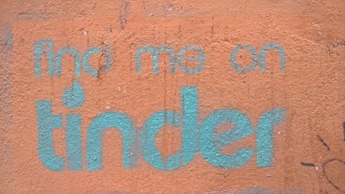
“Find me on Tinder” Roma 2016″ (CC BY 2.0) by Ithmus
Much of the success of Tinder is born from its simplicity, and this is an element Badoo sought to emulate. Alongside redesigning aspects of their app, Badoo saw considerable success in changing their logo.
Rather than keeping the colourful and oddly shaped original logo, Badoo instead turned to a simplistic font, with the addition of basic branded heart.
Simplicity, in this case, was the name of the game, and these 2017 changes have brought Badoo to 428 million accounts and climbing.
Guinness – Respecting the Legacy
Rebranding a long-standing business comes with significant challenges. Chief among these is how exactly a rebrand should draw from a legacy with decades or centuries of attention. This is a problem Guinness has seen over the years, ever since their original introduction in 1759.
Guinness is no stranger to logo redesigns, having seen multiple in 1862, 1955, and 1968, among others. This kept a path of simplification, deviating ever further from the original design. In 2016, however, the idea was floated to take a few steps back.
Their new logo, of a much more detailed harp, more closely resembles the original logo which Guinness launched with all those years ago.
Even though nobody here today was there to see it, the very image captures the identity of an Irish classic, which helps maintain an identity which some feared was slipping.
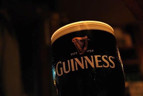
“Guinness” (CC BY-SA 2.0) by [puamelia]
There is no one type of right redesign for every business. Being successful on this front means understanding where a business sits in an industry and which of its elements it wishes to build upon. Both past and future need to be addressed, where a company has come from and where it wants to go. As the above examples have shown, the best rebrands understand their audience and the audience which they wish to bring.