
The checkout page is the page that brings in your actual revenue. But often, a fair number of shoppers that first committed to the purchase process, abandon a few final steps and never return. Why?
The checkout process becomes too overwhelming. The customers find new, unexpected fees and charges, paid delivery, too many input fields, technical and validation issues, negative front-end experience, etc. at the checkout.
This article shares five working means designed to improve a checkout page on your website.
Let’s get right into the data.
Five proven ways to optimize checkout
Though there is a no-size-fits-all strategy when it comes to eCommerce checkout page experience optimization, certain means have a high likelihood of minimizing cart abandonment rate.
This makes sense if you think about it…
Just a minuscule boost by 1% conversion rate is likely to add thousands of dollars to your business.
So, first things first:
Play up with one-page checkout
The standard 6-step checkout process―product page→shopping cart→review items→shipping and billing info→payment info→order confirmation―creates too many opportunities to ditch the flow.
Customers expect checkout that is:
Simpler. Faster. With less clicking.
And one-page checkout creates such an opportunity, i.e., it offers everything that a shopper needs to fill and learn about the order on one single page. To finalize a purchase, one click of the “Order” button becomes enough.
In fact, there is a pool of possibilities to integrate such functionality in your e-store with ease. All you need to do is understand your customers’ expectations from their checkout experience.
How can you do that?
Study your competitors and analyze the way they do it. It will become your starting point, and then go further and investigate checkout trends and best practices to make something even better.
For example:
Merchants who have both online and brick-and-mortar stores should consider a delivery-oriented approach to one-page checkout.
Here’s what it is about:
Shoppers are offered two different checkout flows depending on what delivery option they select. Thus, the relevant data only gets displayed following what delivery flow a customer chooses.
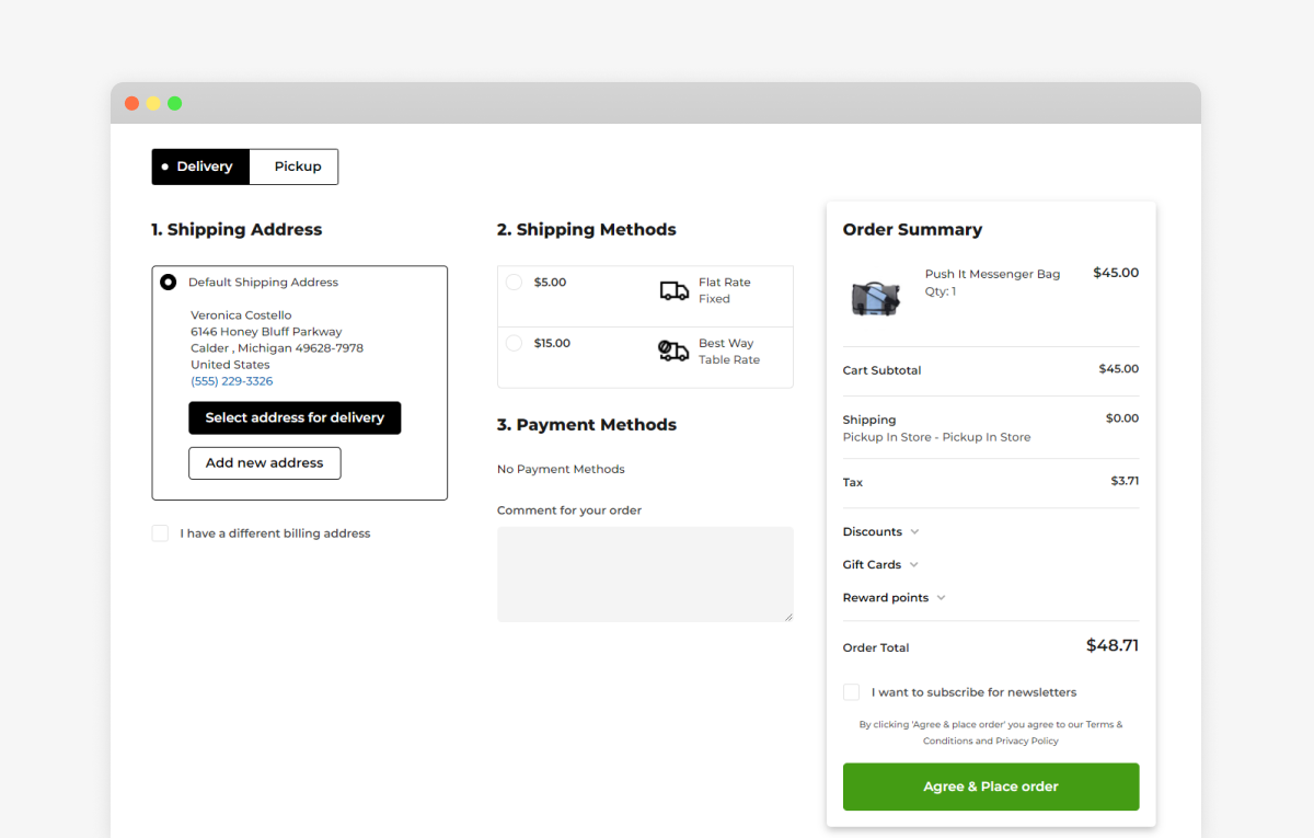
Image source: Mageworx, Magento Development Company
Enable guest checkout
This is another shtick that accelerates the checkout process.
The customers are not forced into sharing their personal details, logging into, or creating a store account.
However, some drawbacks do come along. Brands do not get a chance to retain data that customers enter and use it further in their marketing and sales activities.
Alternatively, consider asking to create an account after the order was placed. At a pretext of tracking the status of an order or faster next-time checkout experience, give your customers a chance to register afterwards.
What else?
Social login has also proven itself as a great means to help a user create an account in no time. This one-click process gives you more than a quick on-site account creation. As a merchant, you can access much more information. From demographics to hobbies and interests, you get a chance to personalize the user experience of your shoppers.
Avoid unnecessary fields
According to Baymard’s research, an overage checkout form contains 15 input fields, and it’s twice as many as necessary. They insist that the fewer fields the shoppers are offered, the less likely they are to ditch their carts.
But how?
Stop asking for the same information several times during the checkout flow.
For example, if your customers already entered their zip code to calculate shipping cost, try to avoid making them retype it further.
Thus, think carefully through what checkout fields you enable and avoid duplicative forms.
Moreover, you can always collect extra data by offering to complete personal accounts on your site. Don’t scrimp on awarding you customers with reward points or internal credits for taking their time to share specific personal data.
Consider autofills
People hate filling out forms. Mobile checkout can turn into a nightmare if mal-designed and unresponsive.
As a workaround to a slow checkout process and frustration, browsers allow customers to autocomplete things on behalf of the user.
That’s not know-how but make sure it doesn’t slip out of your mind. Your developer should tweak autofill attributes to control how a browser should populate specific form fields.
This simple yet powerful gimmick will help reduce user drop-offs and speed up the checkout process.

Image source: Web Fundamentals
Offer extra
There can be a variety of reasons behind cart abandonment. The human component is still high. There are types of buyers who need time to size their potential purchases up, run a comparison, contemplate, and then complete an order. Possibly, the buyer just does not have any intention to buy yet.
There is nothing you can do about that but be ready and ensure your site allows the shoppers to return to the checkout process effortlessly, without having to repeat all the steps of the checkout flow.
The solution?
Make shopping carts in your store restored easily.
The digital world has invented a fair number of means to recover shopping baskets and retain cart abandoners. Here’re a few ideas for you to integrate into your e-store:
- Ability to save a cart
- Adding a cart to the wishlist
- Abcart emails
- Omnichannel marketing
- Notification via messengers
- Loyalty programs
- Personalized gift cards
- Retargeting campaigns
In other words, abandoned carts create even more opportunities for you to offer extra and highlight your brand. Here, you can showcase your values, make your brand noticeable, and re-engage with would-be customers later on.
Bottom line
That wraps up our analysis with the following takeaways from our recommendations:
- Consider a one-step checkout.
- Make guest checkout possible. Otherwise, consider prompt social login options.
- Don’t add input fields that can be avoided.
- Suggest autofills to speed up the process.
- Allow users to save their carts or wishlist them.
We hope you found the insights interesting and useful. Do you already have all the mentioned means polished on your websites? Which one are you planning to improve first if any?
Either way, we welcome you to share your thoughts in the comments field below.