
In the modern business world, an organisation’s brand image can be as important as the goods or services it produces. A strong brand image is a powerful asset. A recognised and trusted brand identity makes people confident that the organisation is dependable. This is why successful businesses work hard at building their brands and present them in a clear and consistent way.
Corus is the leading international metals producer. Corus is a relatively new company. It was created through a merger in October 1999 between the UK’s British Steel and Dutch company Hoogovens. This merger created an innovative metals company that combines international expertise with local service. The Corus headquarters are in London. Twenty-one businesses are located worldwide.
This case study shows how Corus has set about building a consistent, respected brand identity that can be quickly recognised, with a view to giving the company a worldwide competitive advantage.
The importance of brand
We usually associate the term ‘brand’ with a product that has a unique, consistent and well-recognised character eg Coca-Cola, MG, Weetabix. These brands conjure up images in the minds of consumers. Large organisations work hard to raise the power and status of their brands and guard them carefully against unlicensed use or unfair imitation.
A brand usually carries a logo or trade mark by which it is recognised. Many shoppers can easily identify a Heinz can or a Kellogg’s packet, for example, and it is the brand which is drawing them towards the product. Developing a corporate brand is important because a positive brand image will give consumers, and other interested stakeholders, confidence about the full range of products and activities associated with a particular company.
Product range
The product range and service package associated with a company must fit with the corporate brand. This fit will come through product quality and performance, as well as in the consistency of advertising and packaging, and in customer service. Company image is not confined to product branding. All of the organisation’s activities need to be carried outand presented in a consistent and desirable way. This will help to create a strong positive image of the company.
‘Image’ is an amalgam of an individual’s personal experience of a company or product, plus whatever he or she has read or heard from other sources. Advertising can help create or re-shape an image, but personal experience and the comments of other users represent the reality behind the image and, as such, are even more powerful. Organisations therefore need to work very hard to create brand identities which are not only visible in terms of products, logos, company uniforms etc, but which are also built into practical actions of the company and its workforce eg how the company handles and responds to complaints and to crises.
Creating a brand identity
After the merger, Corus gave priority to creating a new brand identity. Choosing the new name was a long, careful consultative process. The first step was to identify the values of both companies and to encapsulate them in the name and logo. The consultation established:
- the views of customers, suppliers and employees
- those aspects of the existing organisation of which they were most proud.
In this way, the best features of the former brands could be fused with new ideas to form a new brand. The new brand would thus reflect and underpin the nature and behaviour of the organisation, with the name and logo being at the forefront of the organisation and its activities. The consultation exercise produced criteria for a new name. It had to be:
- truly international
- easily pronounceable worldwide
- distinctive within the metals market.
Brainstorm sessions generated a list of 2,000 names which were reduced to 100, then to 10, and finally to 3, from which Corus was chosen. It was chosen because it provided a fresh, distinctive name that could become instantly recognisable and also pronounceable worldwide. While the name and logo would clearly be the most visible aspects of the new organisation, they would need to be supported by key features of the organisation eg behaviour, attitude, ways of working, to meet the needs of customers.
Implementation
The Corus ambition is to build a strong powerful brand that looks and means the same all over the world. A powerful brand must have attention value, whether it be in neon lights or on the side of a vehicle. We notice powerful logos wherever they appear eg on filling stations and fast food outlets. They always look the same and, if we enjoy the associated product, the logo acts as a guarantee of satisfaction.
Branding works because customers’ choices are based on emotion as well as logic. Of course, a chocolate bar or fizzy drink may be an easier image to present than that of a diverse industrial group like Corus. However, the same principles apply. Consistency in how the Corus brand is presented is the key to building a strong brand image. In the same way that the name Apple is used by a computer company to signify knowledge and freshness, the word Corus suggests a united company. It helps to convey the idea that all the operations within Corus have different strengths but are more powerful when their voices join together. Today, the Corus brand stands for one company, with one name and one vision.
Quality
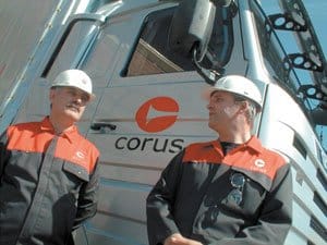
An outstanding feature of the Corus mark is its quality. It comprises two elements, a symbol and a wordmark which combine to be one entity. The large, red ‘C’ (the symbol) is designed to be recognised immediately. The colour hints at a bold business approach, consistent with a new beginning. The name (the wordmark) appears in a contrasting colour and in its own distinctive typeface. The symbol is never used without the wordmark.
The new mark is used in Corus advertising, marketing, promotions, brochures, on uniforms, vehicles, signs, stationery and is even stamped onto products. The intention is to etch the mark into customers’ consciousness. To create this consistency, brand managers at Corus created a set of standard guidelines for the whole organisation covering many aspects of branding eg:
- the exact shade of red to be used
- a housestyle for company literature and stationery
- livery on transport (vans, lorries)
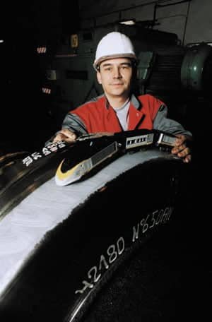
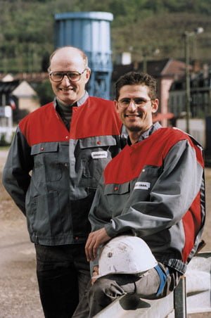
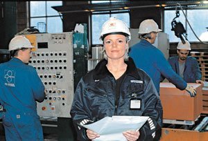
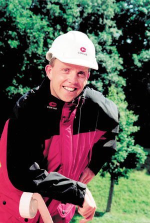
- company workwear
- layout and content of the company web-site
- signs, logos on buildings.
The overall intention is to promote the objective of creating ‘one company with one look’, worldwide.
Stakeholders
It was vital to quickly win support for the new brand from all of the organisation’s key stakeholders inside the organisation. On the day Corus was launched, communication packs were delivered to all parts of the business and presentations took place at the same time on the same day throughout the Company. These were to explain the nature and purpose of the new logo and the new brand. Information was also provided for suppliers and customers, and advertisements were placed in national newspapers throughout key areas of Europe – Netherlands, UK, Belgium, Norway, Germany, France, Spain etc. This was followed up with a series of billboard advertisements in the manufacturing towns where Corus has plants.
Corus also produced ‘Merger News’, a series of booklets which it mailed home to all of its employees worldwide to keep them informed of the changes. These were also available to customers, suppliers and others, and were well received. They gave answers to questions such as: ‘Why the new name?’, ‘What does it mean?’. Subsequent booklets were titled ‘Corus News’ and more recently ‘Corus World’. Today they are designed to provide an open channel of communication with employees.
Open communications
Corus has continued the process of open communications eg by running focus sessions with groups of employees to discuss new workwear designs. Employees are invited to comment on what they like and suggest improvements, for example all red for better visibility, reflecting the importance of health and safety to Corus employees.
Brand seminars are held for Corus communication managers to ensure the integrity of the Corus brand is always preserved. In its external communications Corus has concentrated on creating a consistent approach in all of its literature, eg brochures, posters, press releases, education resources etc to reinforce brand consistency.
The strapline associated with the company is ‘Corus the future in metal’. This reflects the confidence and ambition within the company. It is used, with pictures of end products to illustrate the many ways in which customers benefit from Corus products and services eg in high-precision engineering, cars and civil airliners.
Conclusion
Establishing a new company and a new brand is a massive undertaking. Its approach has proved highly successful. Today Corus is a widely recognised brand that has quickly developed a strong presence in the international metals industry. Rebranding the organisation has made it possible to open up new opportunities while building on the strengths of the past. Because developing a strong brand depends so heavily on creating appropriate perceptions, the internal and external communication exercises have been vital in quickly building up the confidence of stakeholders. Creating a consistent and well-recognised character to the company throughout the globe based on quality, performance and presentation will have beneficial results, reinforcing the ethos of ‘one company, with one name and one vision’.